Update: Design improvements for your career site


Joakim Nordlund
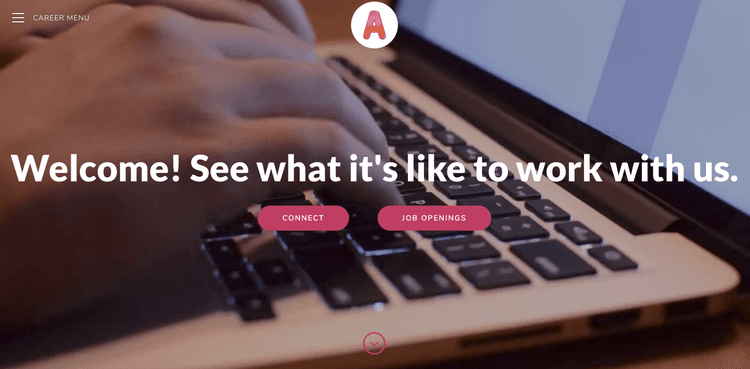
Well, it’s not just Teamtailor as a company that’s growing. Today we update our customers career sites for increased readability with bigger font sizes, wider text sections and better contrasts. We push this updates to all our customers and here’s why.
Getting bigger 💪
The increase in font sizes improves legibility, readability and usability of the content. When it comes to our brains processing power, we can get overwhelmed by the large amount of information displayed at once, making it hard to focus. A larger typeface has been proven to enhance readability. Bigger text require less focus. Minimised clutter leads to improved usability. For us it’s about giving your candidates a better reading experience.
Larger font sizes needs more room to breathe, a good use of whitespace to group and organise the content. And yes — this means that your career pages just got a little bit longer, and that’s perfectly fine. Readability is more important than the amount of scrolling required — good content won’t prevent users from scrolling. It’s natural — an established pattern on the web.
Nowadays when it comes to content we finally tend to focus more on clarity, keeping things clean. Bigger text inspires to use less words and focus on getting to the point. That’s probably one key to why we’re seeing larger font sizes across the web. We hope this will encourages our customers to improve their writing and create a better reading experiences for the candidates. And think about it, your candidates, they simply read more on your career site compared to their regular browsing. Heck, it makes sense, they’re looking for their future.
Larger font sizes also appears more prominent and have more conviction in its message. It brings out the design nuances of a typeface and improves the aesthetic beauty. And by boosting the color for a greater contrast we really think we have improved the reading experience of your career sites.
One more thing 😘
As a bonus, we’ve also updated the design of our department boxes with a fresher look and better image ratio. The full page navigation has also gotten a refresh.
But what about our custom style sheets? 😱
Yes, we know some of you have defined your own style and you should be perfectly fine. But if you catch something that looks funny, don’t hesitate to reach out and we will help you.
Looking forward 👀
And lastly, we want to give you a glance of what’s to come. Instead of pushing updates that affects the career sites in general, we’re working on giving you a wide range of new layout options. Say, for example, you want a text section that is divided into two columns instead of one, or a left side folded navigation instead of the whole page — it´s your choice — you’re in control. Were going to give you a bunch of new options. Sounds good? Yeah, we think so to. 🎈
Hope you all find these updates great and are just as happy with them as we are. Summer is here, wish you all a great one. 🌞
Recommended topics
Check out some more articles that may be of interest!
![]()
Highlights from our latest releases ✨✨
We've collected the highlights from our latest releases. Co-pilot, historic reports and more.
![]()
Set a Job Name that's only shown internally
Make collaboration easier by naming your job what it's called internally, and use a different job ad title for the candidates to see.
![]()
Automatically add to-dos for new users 🥳
Add custom to-do templates so that each new user knows exactly what to do as they first log in, depending on their access level.


